-
ABCB9AKR1B1AKT1ARAFARAF_p.D429A ARAF_p.L96Q ARAF_p.S214C ARAF_p.S214C, p.D429A ARAF_p.S214F ARAF_p.S214F, p.D429A ARAF_p.V145LATF2BRAFBRAF_p.A762E BRAF_p.D594H BRAF_p.G466A BRAF_p.G466E BRAF_p.G466V BRAF_p.G469S BRAF_p.G469V BRAF_p.H574N BRAF_p.H574Q BRAF_p.K601N BRAF_p.L485S BRAF_p.L613F BRAF_p.N581S BRAF_p.P367R BRAF_p.R682W BRAF_p.V600E BRAF_p.W450LCASP8CCND1CGREF1CTNNB1CTNNB1_MAPK7 CTNNB1_p.F777S CTNNB1_p.G34V CTNNB1_p.G367V CTNNB1_p.I140T CTNNB1_p.S33N CTNNB1_p.S37C CTNNB1_p.S45F CTNNB1_p.T41A CTNNB1_p.V600GDARCDCAF8DOK1EGFREGFR_p.769_770insASV EGFR_p.773_774insH EGFR_p.774_775insHV EGFR_p.A237Y EGFR_p.D837A EGFR_p.E545Q EGFR_p.ELR746del EGFR_p.ELREA746del EGFR_p.ELREA746del.p.T790M EGFR_p.G901V EGFR_p.H1129Y EGFR_p.K754E EGFR_p.K754I EGFR_p.L62R EGFR_p.L833F EGFR_p.L858R EGFR_p.L861Q EGFR_p.L907M EGFR_p.Q1020H EGFR_p.R1052I EGFR_p.R222L EGFR_p.R377S EGFR_p.S645C EGFR_p.S768I EGFR_p.S921R EGFR_p.T790M EGFR_p.T790M, p.L858R.o EGFR_p.V769LERBB2FAM173BFBXW7FCGR3BFGFR3GPR137BHAVCR2HRASIDH2KEAP1KEAP1_p.A159P KEAP1_p.A191T KEAP1_p.D389Y KEAP1_p.D479G KEAP1_p.E117K KEAP1_p.E218V KEAP1_p.E611D KEAP1_p.F139L KEAP1_p.F246L KEAP1_p.F280Y KEAP1_p.G333C KEAP1_p.G333S KEAP1_p.G364C KEAP1_p.G417E KEAP1_p.G417R KEAP1_p.G419W KEAP1_p.G480W KEAP1_p.G524C KEAP1_p.G603W KEAP1_p.H96L KEAP1_p.I461V KEAP1_p.L100P KEAP1_p.L268P KEAP1_p.M110I KEAP1_p.M503K KEAP1_p.N397del KEAP1_p.P278R KEAP1_p.P278S KEAP1_p.Q284L KEAP1_p.R204P KEAP1_p.R260L KEAP1_p.R261P KEAP1_p.R272H KEAP1_p.R272P KEAP1_p.R320M KEAP1_p.R320P KEAP1_p.R415C KEAP1_p.R460G KEAP1_p.R470C KEAP1_p.R470H KEAP1_p.R470S KEAP1_p.R601W KEAP1_p.S102L KEAP1_p.S144F KEAP1_p.T142M KEAP1_p.V155A KEAP1_p.V99L KEAP1_p.W497L KEAP1_p.Y141FKRASKRAS_p.D33E KRAS_p.G12A KRAS_p.G12C KRAS_p.G12D KRAS_p.G12F KRAS_p.G12R KRAS_p.G12S KRAS_p.G12V KRAS_p.G12Y KRAS_p.G13C KRAS_p.G13D KRAS_p.G13V KRAS_p.Q61LMAP2K1MAPK7MAXMDM2METMET_ex14del MET_p.E1314G MET_p.F1341L MET_p.H644N MET_p.K2N MET_p.M1160L MET_p.S441C MET_p.Y1003F MET_p.Y1235HMYCNFE2L2NRASPIK3CAPIK3CA_p.123_124MP>IA PIK3CA_p.E453Q PIK3CA_p.E542K PIK3CA_p.E545K PIK3CA_p.E600K PIK3CA_p.E726K PIK3CA_p.H1047R PIK3CA_p.L699M PIK3CA_p.Q137L PIK3CA_p.Q296E PIK3CA_p.R108HPIK3R3PPP2R1APPP2R1A_p.A541G PPP2R1A_p.C148F PPP2R1A_p.C329F PPP2R1A_p.Q372L PPP2R1A_p.R183W PPP2R1A_p.R258H PPP2R1A_p.R46S PPP2R1A_p.V229L PPP2R1A_p.W140CPTENRAF1RARARB1RBM10RBM45RIT1RIT1_p.A192T RIT1_p.A192T.unin RIT1_p.A77P RIT1_p.F82L RIT1_p.K23E RIT1_p.M90I RIT1_p.Q40L RIT1_p.R122L RIT1_p.T76insTDLT RIT1_p.TA83delSERPINB5SERPINB5_p.A165T SERPINB5_p.A42F SERPINB5_p.A7T SERPINB5_p.D141A SERPINB5_p.G142V SERPINB5_p.I159S SERPINB5_p.T37ISTC2STK11STK11_p.D176A STK11_p.D176H STK11_p.D194Y STK11_p.D194Y.unin.fs STK11_p.G242W STK11_p.G251F STK11_p.G251V STK11_p.G56V STK11_p.G56W STK11_p.H168R STK11_p.K78E STK11_p.L245F STK11_p.N181I STK11_p.N181Y STK11_p.P221L STK11_p.S216F STK11_p.W239CTPK1TPK1_p.D29Y TPK1_p.E81Q TPK1_p.G48C TPK1_p.K111M TPK1_p.L185I TPK1_p.P152T TPK1_p.T205S TPK1_p.T213SU2AF1ZBTB24ZNF597
KRAS_p.G12R
KRAS_WT.c
Profile Prediction Class p-value Cell Painting Impactful GOF 3.26768e-05 L1000 Impactful GOF 0.0001766977 These matrices show how similar the replicates of each pair are (reference gene self-correlation, reference-variant cross-correlation, and variant self-correlation). The correlation matrix colors represent the correlation values in the range from -0.2 to 1.0.
The box plots show the distribution of median values of the matrices’ rows (self-correlation) and columns (cross-correlation).
These matrices show how similar the replicates of each pair are (reference gene self-correlation, reference-variant cross-correlation, and variant self-correlation). The correlation matrix colors represent the correlation values in the range from -0.2 to 1.0.
The box plots show the distribution of median values of the matrices’ rows (self-correlation) and columns (cross-correlation).
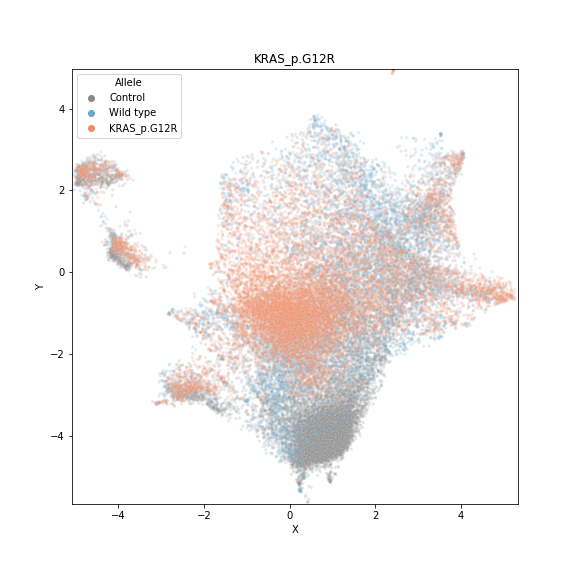
UMAP projection — Phenotypes
The axes are the first two UMAP coordinates. Each point represents a single cell and the color corresponds to the treatment status (control cells in blue, reference gene cells in green, and variant cells in orange).

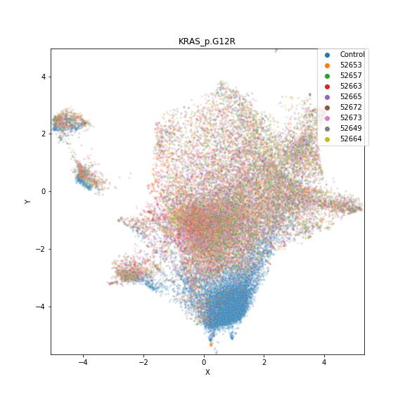
UMAP projection — Plates
Same UMAP projection as above, but each cell is colored according to the plate where the replicate comes from (legend numbers indicate plate numbers). Ideally, colors should be well integrated (random coloring patterns) indicating that the feature space is not dominated by technical artifacts.

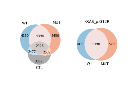
Phenotypic overlap in the feature space
Each single cell in the sample visualized above was classified as having one of 7 potential phenotypes (according to the perturbation status of the nearest neighbors in the connectivity graph): 1) pure reference gene, 2) pure variant, 3) pure control, 4) shared reference-variant, 5) shared reference-control, 6) shared variant-control, 7) mixed of all. With these classifications, we quantify how much phenotypic similarities the populations of cells have in common, which is represented in the Venn diagram

Display the magnitude and directionality of predictions for all alleles in a gene set. The x-axis represents the negative log p-value of the impact test (the larger the more impactful), and the y-axis represents the log p-value of the directionality test polarized by the result of the strength test.